8 ways to get people to sign up for your newsletter
Want the good news or the bad news first?
Let’s go with the good news: Email marketing is incredibly effective for B2B companies and professional services firms.
And now the bad news: Your email list degrades by about 22.5% every year. People change jobs, unqualified leads unsubscribe and others disengage after emails get trapped in spam folders.
I’m no mathematician, but with a churn rate of 25%, if you don’t grow your email list, you’ll be left with just you and your grandma reading your emails in a few short years.
Here’s more good news (you just got served a shit sandwich): There are lots of ways to grow your email list, and I’ve helpfully summarized them for you below.
1) Create a page dedicated to your email newsletter
In order to drive sign-ups, you must have a website page dedicated to your newsletter. This is where readers learn what your newsletter is about and the kind of information they can expect to receive. It also allows them to sign up, browse past issues and select their preferences.
On our newsletter page, we do all of the above (trying to walk the walk, ya know?) except for a preferences section. When you select your industry, you are automatically added to one of our two lists: B2B (this is for business-to-business marketers in a range of industries, such as AEC and tech), or legal (for marketers in law firms).
It’s key to have a landing page for your newsletter (here’s Neil Patel’s), as without it, you have nowhere to direct potential subscribers to sign up. Don’t rely solely on a subscription form on your home, news or blog pages; create a standalone page focused on the newsletter. By sending readers to a page that only asks them to do one thing, you are eliminating distractions and clearly communicating to visitors what you want them to do: sign up for your newsletter.
2) Use a “lead magnet” to drive sign-ups
People call these different things: lead magnet, content offer, downloadable or gated content. But whatever you call it, a lead magnet is simply an incentive to get your target audience to fill out a form, give a bit of information and, in return, receive something valuable.
Lead magnets should be valuable enough to your target audience that they are willing to fill out your form (and subscribe to your newsletter). It should be clear that when they fill out the form, they are agreeing to opt-in to receive email communications from you, including your email newsletter. Here’s an example:
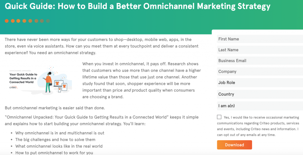
Lead magnets take many formats: e-books, checklists, case studies, templates, toolkits, how-to videos, worksheets, tutorials, guides, research reports, white papers…the list goes on. Whatever the format, the content must be compelling enough to convince your audience to sign up.
3) Create an archive of past newsletters
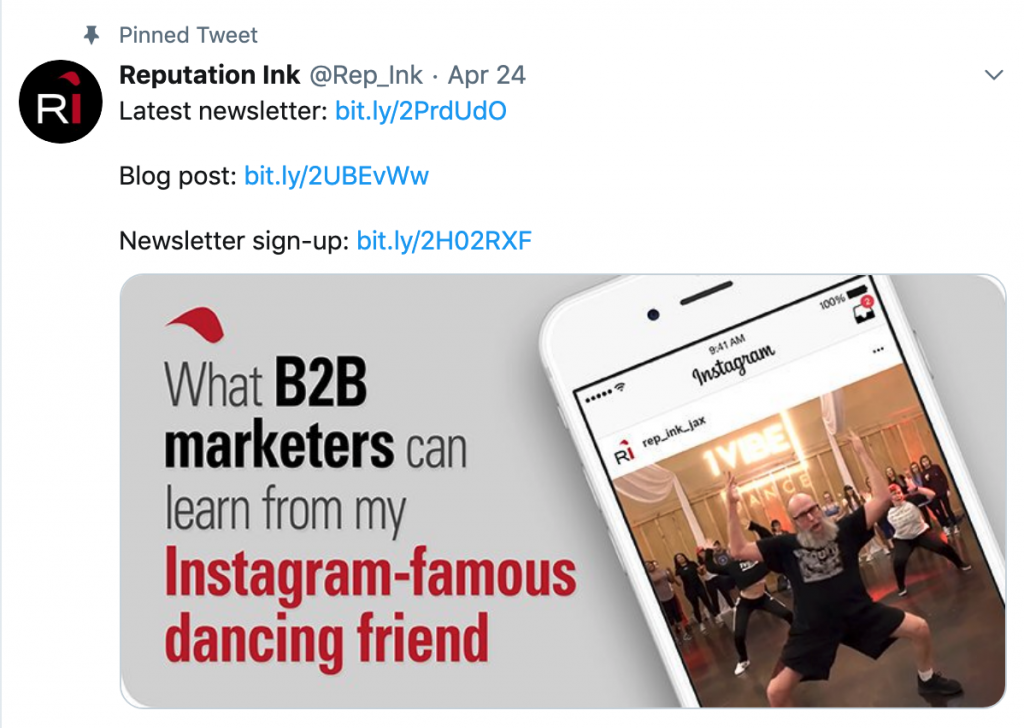
People want to know what they’re getting themselves into. Post your newsletter editions online so that you can allow people to see what they’re signing up for. In addition, a newsletter archive enables you to promote your newsletter on social media, like this:
4) Add pop-up forms to your website
A pop-up is what it sounds like — a box that pops up on a webpage, asking the web visitor to take action. While controversial, pop-ups work: They drive higher conversion rates.
Here’s one of ours:
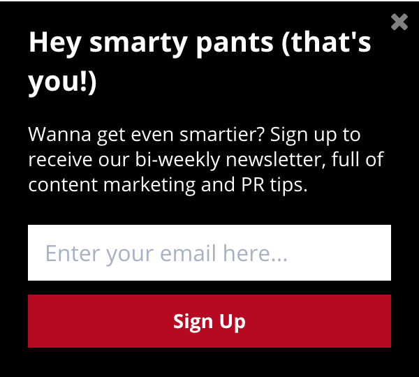
I understand if pop-ups feel spammy or annoying to you, however there are ways to make them less intrusive feeling. For example, you can create pop-ups that appear:
- After a delay, instead of immediately
- After the reader scrolls halfway down the page
- Upon exit intent (i.e., the reader is about to leave your site)
Like everything, it’s important to test different versions of pop-up forms to see what works best for you.
5) Strategically place sign-up forms and CTAs
There are a gajillion ways to let people know about your newsletter and encourage them to sign up. Calls to action — or CTAs — are simply boxes with a headline, a bit of text and a form for subscriptions. Strategically place these throughout your website, the newsletter itself and social media to drive sign-ups. Here are a few options:
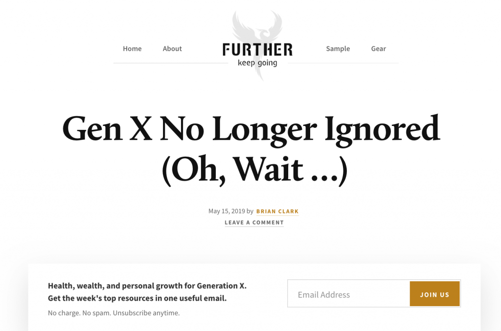
- Top- or bottom-of-story CTAs — Place a box at the top or bottom of your blog post to drive subscriptions. In Brian Clark’s Further newsletter (one of my faves), he puts a subscription form right below the headline of his blog posts:
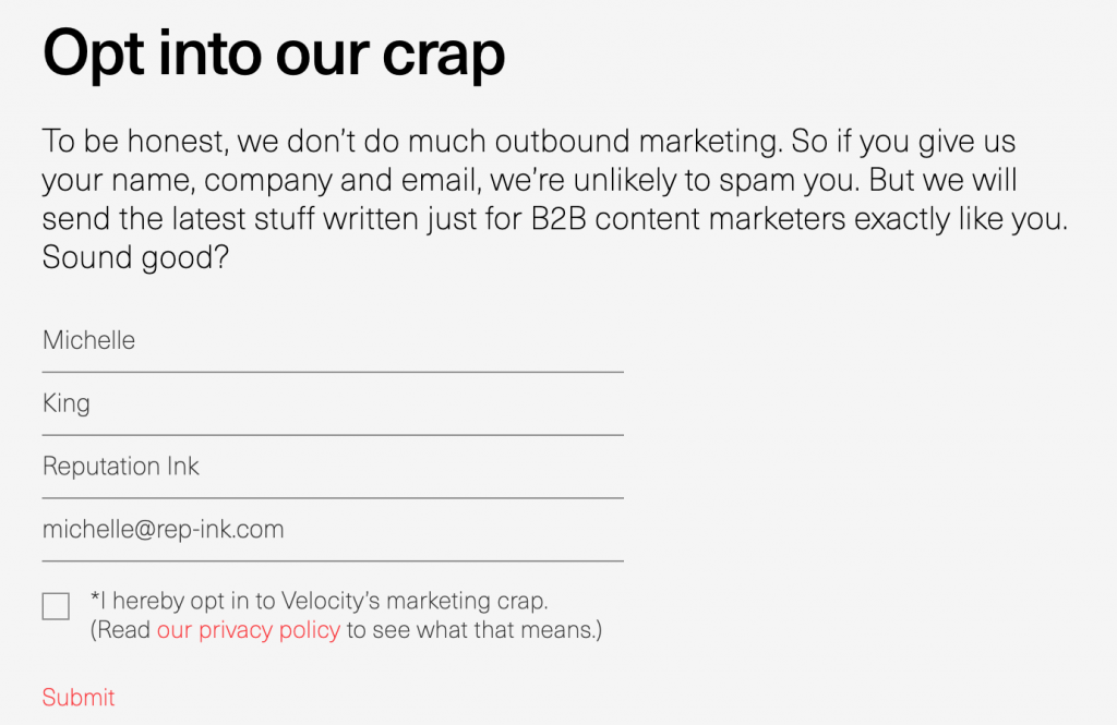
And here is B2B marketing agency Velocity Partners’ bottom-of-story CTA:
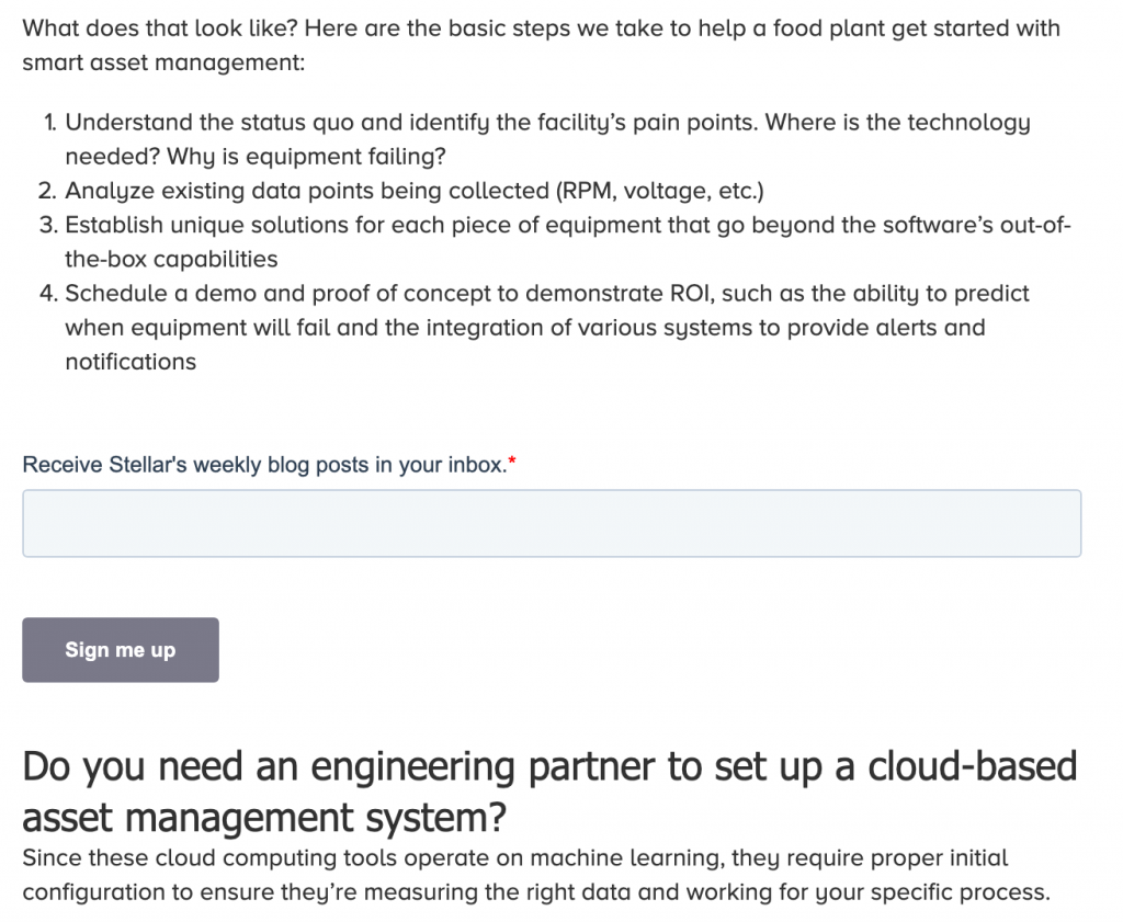
- Inline CTAs — Some readers may never make it to the end of your blog post. Grab their attention by inserting a sign-up form midway through the story. Here’s one from our client, Stellar:
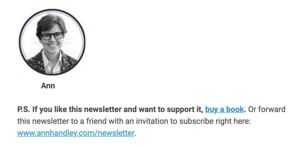
- Inside-the-email CTA — Remind readers to share the newsletter with their friends and give them a link to forward it along. Here’s how Ann Handley, author of “Everybody Writes: Your Go-To Guide to Creating Ridiculously Good Content,” does it:
- Footer or header CTAs — Include a form to subscribe in the footer or header of your website, so that you have a newsletter presence on every page of your site. Here’s another example from Ann Handley:

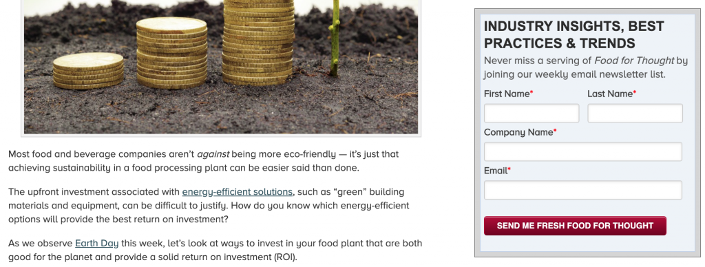
- Right-rail CTA — Add a sign-up box to the right of a blog post. Here’s an example from our client Stellar:
6) Leverage social media
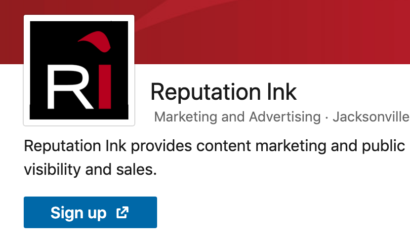
Change the buttons at the top of your LinkedIn and Facebook company pages to “sign up,” with a link to your newsletter subscription page. Here’s how our LinkedIn and Facebook pages look:

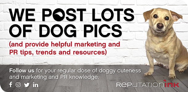
You can also create CTAs to promote sign-ups within your social media feeds, like this:
7) Promote in author bios
In many B2B and professional services firms, your subject-matter experts have extensive networks on social media — including prospective clients, partners and influencers. This is a valuable resource to tap into. Consider asking your subject-matter experts to add a line to their LinkedIn or Twitter bios, with a link to the newsletter, like this:

Also ask them to add the newsletter link to their bio pages on your website.
8) Add to email signatures
And finally, ask your subject-matter experts to add a link to their email signatures promoting the newsletter. If you want to get even more advanced, with marketing automation, you can use trackable links to see where people are clicking the most. For example, you can use one trackable link for all email signatures, and a different trackable link for in-email CTAs.
Did I miss anything? I’d love to hear your thoughts. Email me at michelle@rep-ink.com or follow me on Twitter @MichelleCKing.


