


A blog with stick figures has some of the most engaging marketing copy (and here’s why)
It’s hard to turn off.
Ugh, let me try that again.
Source: Reddit
It’s hard to turn work brain off. (There, much less perv-y.)
So, for me (as a writer and marketer) that translates into silently copy editing Taco Bell marque signs and analyzing the strategy of hundreds of daily marketing messages pummeling me as a consumer (clothing sites, mostly).
Take a recent instance.
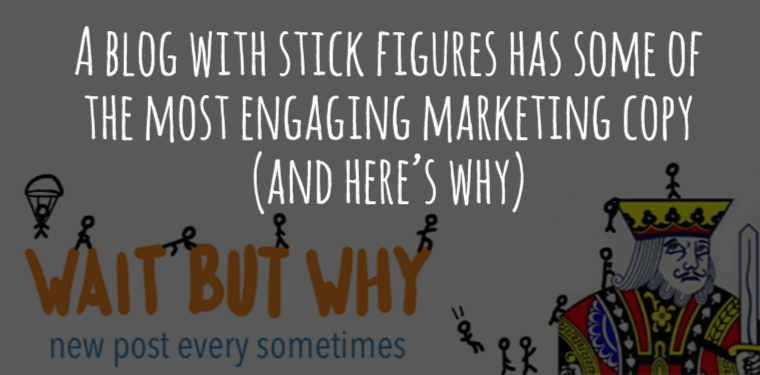
Among the BuzzFeed Tasty videos (mesmerizing) and engagement rings on my Facebook feed (why can’t I zoom in more?) I saw an article making the rounds, titled “Why Generation Y Yuppies are Unhappy” from Wait But Why “a long-form, stick-figure-illustrated blog about almost everything.”
Gave it a click.
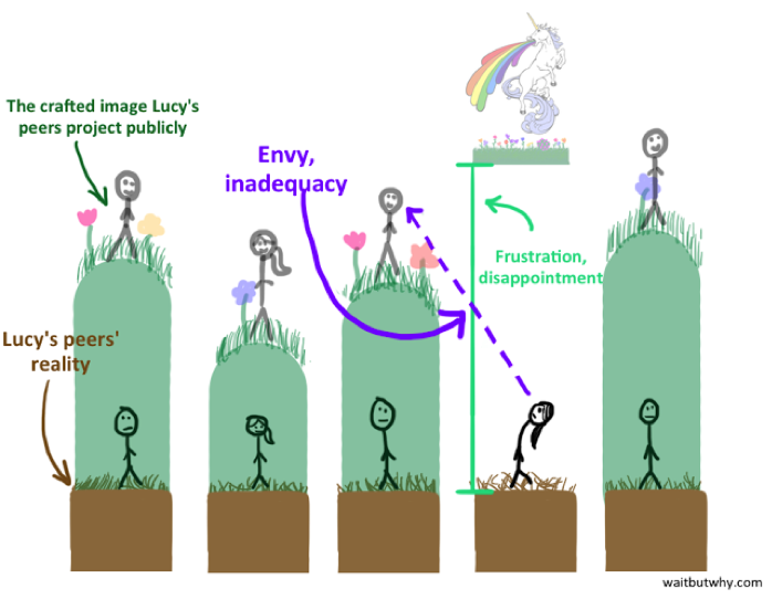
The article rocked/rocks. (Tab it for later.) TL;DR? Millennials often think they’re these special unicorns, have extreme ambition and unrealistic expectations inconsistent with that of any other generation, and their reality is so f’ing far off, they become unhappy, inadequate and frustrated.
I read through the article several times. I shared it with my friends, my mom. I’m Generation Y, a millennial. It’s fascinating and is the first article I’ve seen that explains something so complex, so simply. (We know a thing or two about that.)
Anyway, loved the article, the illustrations, the tone. I poked around the site and swooned over the other posts I saw, too. Good content is rare. Anytime I find it, I’ll gladly exchange my email address.
That’s when that marketing brain I mentioned earlier kicked into high gear. Wait But Why’s marketing copy, specifically for subscribing to its email newsletter, was reflective of the site’s compelling content (which is how it should be, by the way).
It exudes the whole gamut of best practices:
- Be transparent.
- Be conversational.
- Be clear.
- Be concise.
- Elicit action.
- Eliminate anxiety.
- Use clean design.
- Build trust.
Wait But Why nails this. (Chill, you’ll see why in a sec.)
I reached out to Wait But Why’s cofounder, Andrew Finn, to pick his brain on the approach. While he said his co-founder, Tim Urban, is more of the mastermind behind this messaging, he did offer some insight:
“The general philosophy is to be approachable and authentic, and when in doubt, try to be entertaining, without being the annoying person who is trying way too hard.”
Alright, let me show you why this copy/ calls-to-action (CTAs) rock by walking through Wait But Why’s email subscription process at the time I entered their funnel. You can learn a few things to apply to your own marketing.
Email newsletter CTA (pop up)
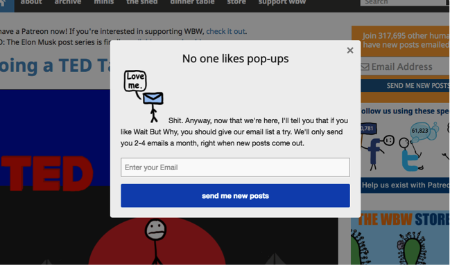
- Headline: No one likes pop-ups
- Body copy: Shit. Anyway, now that we’re here, I’ll tell you that if you like Wait But Why, you should give our email list a try. We’ll only send you 2-4 emails a month, right when new posts come out.
- Form field: Enter your email
- Button: send me new posts
- Why it rocks: Quirky headline that calls itself out. Leverages humor. Reduces anxiety by letting you know exactly what you’re signing up for (2-4 emails a month, right when new posts come out). A button that’s a clear action (not “submit”).
Email newsletter CTA (simple form)
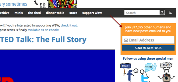
- Headline: Join 317,695 other humans and have new posts emailed to you
- Form field: Email address
- Button: send me new posts
- Why it rocks: Invokes a little FOMO by giving you a taste of how many other readers who pulled the trigger and subscribed. Clearly communicates the value of subscribing with no BS: new posts emailed to you.
Email newsletter CTA (pop up version two)
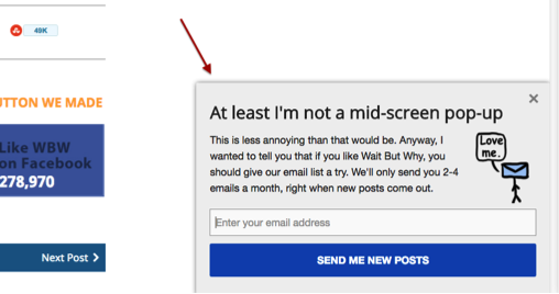
- Headline: At least I’m not a mid-screen popup
- Body copy: This is less annoying than that would be. Anyway, I wanted to tell you that if you like Wait But Why, you should give our email list a try. We’ll only send you 2-4 emails a month, right when new posts come out.
- Form field: Enter your email address
- Button: send me new posts
- Why it rocks: A variation on the first CTA. Wait But Why doesn’t use the same CTA over and over. It mixes it up. Placement, headlines and more can all have an effect on engagement.
Email Newsletter Thank You
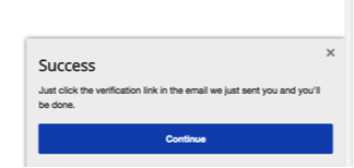
- Headline: Success
- Body copy: Just click the verification link in the email we just sent you and you’ll be done.
- Button: Continue
- Why it rocks: Success = you did it! Let’s you know what to expect next (a verification link in the email) and how much longer you have to commit to this process.
Subscription confirmation email
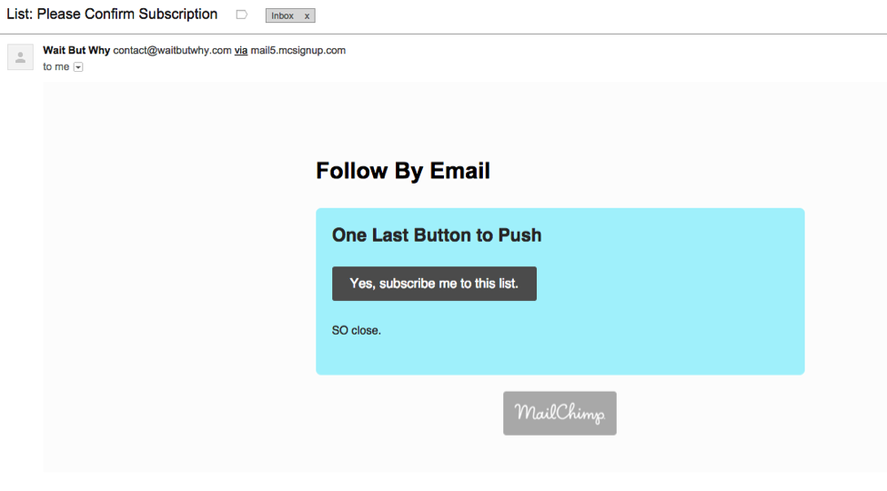
- Headline: One Last Button to Push
- Button: Yes, subscribe me to this list.
- Body copy: SO close.
- Why it rocks: Can’t get any clearer than “one last button to push.” “SO close,” again lets you know how much longer you have to commit to this and shows a respect for your time. Sympathy and empathy messaging, too.
Email subscription thank you landing page
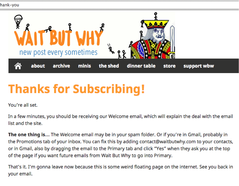
- Headline: Thanks for subscribing!
- Body copy: You’re all set. In a few minutes, you should be receiving our Welcome email, which will explain the deal with the email list and the site. The one thing is… The Welcome email may be in your spam folder. Or if you’re in Gmail, probably in the Promotions Tab of your inbox. You can fix this by adding contact@waitbutwhy.com to your contacts, or in Gmail, also by dragging the email to the Primary tab and click “Yes” when they ask you at the top of the page if you want future emails from Wait But Why into Primary. That’s it. I’m gonna leave now because this is some weird floating page on the internet. See you back in your email.
- Why it rocks: Clearly communicates what you just signed up for. Addresses what you need to do to have the best experience with their newsletter. Again, humor. The team made something otherwise boring to read engaging.
The INKsight
Marketing copy must be engaging. How do you achieve this? By being transparent, clear and concise. Plus, humor can go a long way (knowing your audience, of course). Take time to learn from those who are doing it right. And most of all, you’re marketing person-to-person, approach messaging with that in mind.
Did you recently see some kickass copy or CTAs? Let’s see ‘em.